Nonprofit Landing Pages: How to Turn Visitors into Donors
Picture this: you’re a frequent nonprofit supporter who found a new organization that aligns with your values and you want to donate. You visit its website, only to be met by a barrage of poorly organized information and landing page links crammed onto one page. You get frustrated trying to find what you’re looking for, so you click off the website and find another nonprofit to support instead.
Fortunately, your nonprofit can easily avoid this outcome and secure support by prioritizing web design best practices when creating landing pages. Use these tips to optimize your landing pages for online fundraising and user experience:
As we explore these essentials, consider your nonprofit’s current web design approach and digital strategy, as well as your bandwidth for implementing these improvements. Let’s dive in!
1. Tell a dynamic story
Telling your organization’s story compellingly and emotionally can seem difficult through a screen. However, by leveraging online tools, you can actually tell your story more vividly than you can from just a face-to-face interaction.
Evaluate how you’re currently telling your story on your “About Us” page, then try these strategies to add dimension:
- Incorporate photos and videos. A picture really is worth a thousand words if you use branded multimedia elements to tell your nonprofit’s story. For example, let’s say you represent a food kitchen. Instead of writing a long paragraph explaining your mission of providing meals to hungry families, include a video of one of your beneficiaries describing what life is like in a food desert.
- Use interactive graphics. Clarify and highlight key events in your history with interactive graphics, such as timelines and maps. Continuing with the food kitchen example, you could highlight the different communities you’ve been able to serve and how your influence has grown over time.
- Embed a real-time impact tracker and calendar. Remember that your story is still unfolding, and you can convince potential donors to be a part of it by keeping them updated on your mission’s progress. For instance, you could showcase the number of meals your food kitchen is currently serving and have the tracker automatically update every day or week. Or, you could embed your event calendar into the page so audience members can see that you’re ramping up volunteer opportunities, for example, which is a sign of growth.
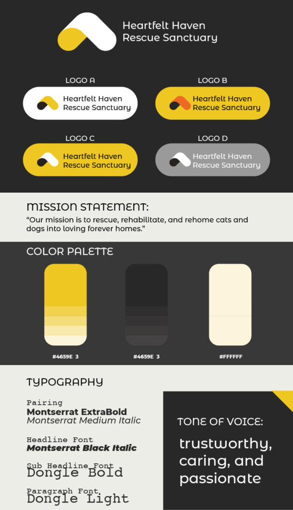
Whichever strategies you choose to tell your story on your website, ensure that your nonprofit’s branding stays consistent so your audience can form a unique connection with you. This includes visual elements, like your logo, and abstract elements, like your tone of voice. Use this sample brand guide for a fictional nonprofit from Fifty & Fifty’s guide to nonprofit branding to inspire your own branding journey:
2. Use a CMS made for nonprofits
As a nonprofit professional, you’re likely more focused on your mission than on learning the ins and outs of web design. That’s why it’s so important to find a content management system (CMS) or web builder that’s custom-built for nonprofits like yours.
There are several options available, but Nonprofits Source’s guide to web design suggests looking for a solution with these top features:
- Intuitive interface. Your landing page builder should be accessible to everyone on your team, even those with limited technical expertise. Some user-friendly features to look for include drag-and-drop editors and customizable templates that simplify the page design and layout experience.
- Integration with other digital tools. Whether it’s a payment processor, a digital marketing plugin, or an event registration system, your CMS should be able to integrate with your other software solutions to provide a streamlined experience for both admins and site visitors.
- Brand customization. As previously mentioned, your brand is everything when cultivating a community of supporters. Ensure that your CMS can implement your nonprofit’s logo, color scheme, and other visual assets so you can claim your landing pages as your own.
- Accessibility tools. Make your landing pages accessible to anyone who comes across your nonprofit’s website for maximum exposure. Your CMS should be able to add alt text to images, offer keyboard navigation, and support screen readers. This ensures that people of all backgrounds and abilities can navigate and make use of your website pages.
- Search engine optimization (SEO) features. Publishing your landing pages is just the first step to securing supporters online. SEO can help you reach people who are more likely to convert (your target audience) by incorporating keywords that are relevant to your cause. Then, search engines will serve your landing pages to users looking for similar information. Web builders that come with SEO tools built-in are ideal for accessing your target audience.
Choosing a CMS is an important decision, so ensure that you lay out your needs ahead of time, research your options carefully, and leverage free trials and consultations with providers so you find the best fit.
3. Establish trust with the audience
Just as with other forms of nonprofit marketing, it’s crucial to leverage your landing pages to build trust with potential supporters. To bolster your brand’s credibility with your landing pages, you might:
- Include impact metrics. Ultimately, your donors need to know that your nonprofit will use their gifts to make a real difference. Convince them of your skills by highlighting impressive impact metrics. For example, you could embed calls-to-action that prompt site visitors to read your annual report with eye-catching statistics. Emphasizing your impact metrics across all landing pages establishes a trusting and transparent relationship with site visitors.
- Use social proof. Your site’s visitors will be more likely to trust your organization if people they care about or even relate to endorse you. You can leverage this phenomenon (known as social proof) by integrating positive testimonials from donors, beneficiaries, and other stakeholders. You could also shout out inspiring supporters on social media and integrate the post into your landing pages with plugins.
As you design your landing pages, leverage any opportunity to establish your positive reputation. After all, landing pages are highly visible, making them a great addition to your nonprofit marketing plan.
Your nonprofit’s landing pages (especially your donation page) are critical parts of your fundraising and donor cultivation strategies. By carefully designing and leveraging their unique qualities, you can transform casual site visitors into passionate supporters.


