eCards are an innovative way to connect with supporters, raise funds, and market your nonprofit. With nearly limitless design options and the ability to be sent instantly, eCards are ideal for nonprofits that want to reach out to supporters in creative, memorable ways.
However, eCard technology is just the initial building block. It’s up to your nonprofit to create standout designs paired with meaningful messages, and those elements are ultimately what make your eCards stand out.
Whether you plan to use eCards to invite supporters to events, boost volunteer retention rates, or thank donors for their gifts, your eCards need compelling designs. To help your nonprofit craft visually striking eCards your supporters will want to save, this guide will explore three essential design elements.
1. Fun and Memorable Visuals
When first opening an eCard, the number one thing supporters will focus on is the visuals. Unique, memorable, and fun visuals will grab their attention and cause supporters to read your card’s message and create a positive association with your nonprofit.
As with any type of marketing, you should first consider your audience and nonprofit’s message before crafting outreach materials such as your eCard visuals. For instance, nonprofits that cater to children and families, like the Girl Scouts, probably have a different idea of what makes for a fun and meaningful visual than a nonprofit dedicated to medical research.
With that in mind, a few ways you can create visually interesting eCards include:
- Photos or illustrations. Both photos and illustrated images can make for standout eCards. Let’s say your nonprofit’s mission lends itself to visually appealing photographs, such as animal shelters or nature preservation groups. In this case, try using professional photographs for your eCards. Or, if you have a skilled graphic designer, create custom illustrations that represent your nonprofit’s cause.
- Animations. eCards can rise above physical postcards with animations. Use your eCard platform to add special effects to your eCards like floating balloons, shining stars, or falling snowflakes.
- Themed images. When creating eCards, many nonprofits design a few staple eCards that can be used for a variety of purposes. In addition to these standard designs that can be used throughout the year, try creating specific themed eCards for holiday fundraisers, supporters’ birthdays, and special occasions. By creating designs aligned with different occasions people already celebrate, you can forge stronger, more meaningful connections.
eCards are highly flexible in how they can be delivered, with various platforms allowing you to send eCards via email, text message, and social media. When designing your eCards consider how you intend to send them to supporters. This can help guide your design choices to ensure your eCards will look right when supporters open them. For instance, for a mobile-delivered eCard, you might choose a vertical design to fit phone screens.
2. Brand Elements
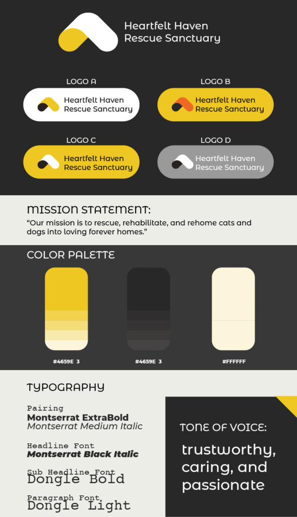
Ultimately, eCards are a reflection of your nonprofit, and supporters should be able to connect their eCards back to your organization at a glance. As such, make sure to include various brand elements in your eCards’ designs, such as:
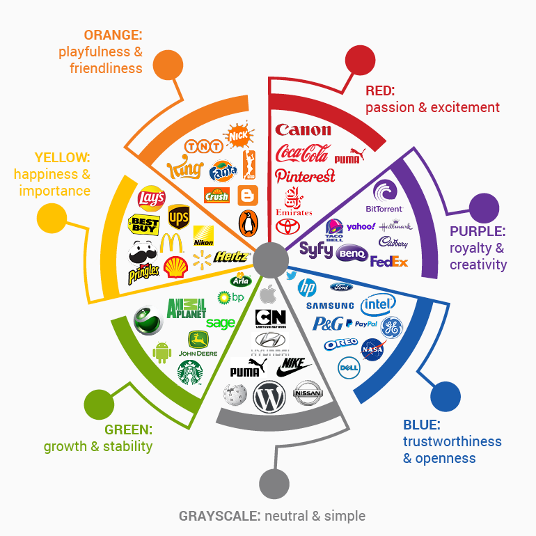
- Colors. Not every eCard you create needs to be entirely in your nonprofit’s brand colors. Instead, simply add your logo, feature specific elements like the border in your colors, or add versions of your logo in colors that match the eCard. Colors set the tone for your eCard so choose ones that fit your goals and brand identity. To inform your design choices, Kwala’s nonprofit branding color chart breaks down the different types of emotions associated with various colors:

- Logo. As just discussed, your logo can be edited on your eCards to fit their designs. For instance, you might have a red or pink version of your logo to fit the theme of your Valentine’s Day eCards. However, always make sure the logo is clearly visible and legible so eCard recipients can connect it back to your nonprofit.
- Imagery. What types of imagery do you want associated with your nonprofit? This might include specific animals, plants, buildings, flags, people, or anything else. For example, the Girl Scouts of Wisconsin Southeast used eCardWidget to create eCards that feature one of their iconic cookies in their eCards.

These elements are especially important if you are using eCards for marketing your cause. For example, if you encourage supporters to send eCards to their friends and family, recipients who were previously unfamiliar with your organization are far more likely to check it out if they can easily connect the eCards to your specific nonprofit.
3. Meaningful Messages
So far, we’ve focused on the visual aspects of eCards, but eCards ultimately have two parts: the visuals and the written message. However, while recipients will look at the message second, it does not mean it’s less important.
Think of it this way: The visuals pique supporters’ interest to get them to open the eCard and read the message. Then, the message is an opportunity to speak directly to the recipient and build a connection with them. Visuals grab attention, and the message holds it.
To ensure the messages inside your eCards accomplish this, follow these tips:
- Get specific. Whether you’re using eCards to thank donors, volunteers, or event guests, get specific about why you want to appreciate them. For donors, this might involve referencing the specific campaign they’ve donated to, while for volunteers, you might discuss projects they’ve contributed to.
- Share impact. eCards are an opportunity to share what your nonprofit has been able to accomplish with supporters’ help. This lets eCard recipients know why your nonprofit matters and feel a need to continue supporting you.
- Tell a story. Try using eCards to tell stories that showcase your nonprofit’s work and why it matters. These might be quotes or short anecdotes from beneficiaries, volunteers, staff, or anyone else at your nonprofit who contributes to your mission.
When deciding your message, consider why you are sending eCards in the first place. For instance, if you’re celebrating a supporter’s one-year giving anniversary, you might share highlights of what your nonprofit has accomplished in the last year. Or, if you’re using eCards to promote an event, you might add details about how your event will support your nonprofit’s mission.
Your eCards’ designs grab supporters’ attention and get them interested in your message. Ensure your designs represent your nonprofit with core branding elements, like your logo, but also fit the theme or message of your eCard campaign. Just be sure to choose an eCard platform that provides the design tools you need to create custom eCards that fit your organization.


